AD CRITICISM- ASSIGNMENT #3: “Under The Sea” for Greenpeace Switzerland By Lowe Zurich
September 24, 2012 § Leave a comment
“The greatest wonder of the sea is that it’s still alive.”
Though there was little information regarding where the ad was originally found, it’s made is way around the internet, and a google search of the title and artist at work, result in a number of sites, citing it as an effective and profound graphic. This piece is done by Lowe Zurich for Greenpeace International: a worldwide organization that claims to exist to the give the “Earth” a “voice”, and aims to do so with action, not merely thoughts. Visually speaking, the group of bottles is grouped and aligned is such a way that it plays with the head of the viewer. It speaks to them in this same way. The replication of a school of fish swimming in this pattern, an image we are used to seeing, is turned upside down when we quickly notice they aren’t fish but, rather, bottles. The sign of bottles in the ocean, as connoted by our own heads, leads to the thoughts of pollution, of the death of aquatic animals, and of littering. We associate the ocean, with life, sea creatures and a healthy blue color and, in actuality, the image remains mainly the same as the image we are used to in our mind, but the one subtle (though profound) change in fish, to bottles, turns the tone upside down. What we are expected to feel when we see such a scene in, say, an ocean documentary, or a national geographic special, (life, purity, cleanliness) is turned upside down to a tone of darkness, of fear, of negative change.
Firstly, the color of blue is striking, but unsurprising as it is an ocean. It suggests a sense of peace, tranquility, and life. Flow and form are combined in this image to create movement; rounded, curved movement around the ocean. This light curve suggests calamity and soundness: an almost beautiful rhythmic movement. The connotation of the rhythmic, calm movement of fish adds to this as well, and even plays to the myth of the ocean. In modern media, it is known that the ocean isn’t as safe and clean as it once was, and the myth of the disappearing ocean plays in here. The sense of life and peace is turned upside down with the bottles. The bottles come to signify pollution, as stated, and in juxtaposition with an image with all the combined elements above, and the preconceived notion of the ocean, give a sense of dread to the viewer, a sense of danger. It calls for action, for change, and for a prevention of the image seen, though it won’t literally happen. The absence of fish creates eeriness in the reader; it at least did in me.
The aim of the ad was achieved in me, and I’m certain it would be similar in others, as well. It completely and effectively conveys its message. A simple, and clean design, void of clutter and full of juxtaposition, eerily displays an image that we are used to seeing. It could, in fact, instill shame in the viewer for contributing to pollution or littering, and in turn contributing to the ideas this ad goes against. We’ve all littered in one way or another at some point, and the ad captures that sentiment. The value of the ad is great, and it does its job in spades.
The Pen Box -Homework Assignment #2- Critique
September 17, 2012 § Leave a comment
The Pen Box exquisitely details Indian symbols and characters, as well as pictures, in a small rectangular, and opalescent display. It glows and shimmers in proper light and in this proper light, also has a rainbow like hue to it. Its regal design is locked in by a shimmering gold border which too, is intricate in nature. Though not awesome in scope or size, it certainly becomes a marvel as one takes a closer look and notices the intricacy, precision and detail crafted into this piece. That alone is worthy of praise. Created by Shayhk Muhammed in 1587, the piece is old but not at all ancient. It is an example of fine media art, crafted not painted or drawn; sculpted with a hand and pieced together and carved bit by bit.
By non-modern means, the pen box was crafted with extreme care and, likely, a lot of time and patience. The designs carved shallowly into the box flow with rhythm, semi-repeating, in and around the box itself; in and out of the main images. Though riddled with many patterns, they all follow a basic flow: a flow that moves from side to side, almost wave-like, and up and down periodically. Ones eyes, seamlessly move about the structure, and only with attention to all the detail can it be fully appreciated. It unifies both pattern and flow into the course of the image, but, amazingly, also provides emphasis to the center: the images themselves. The patterns make somewhat of a crossing point as they maneuver about the work, and here in the center, as a result of the patterns, our eyes notice the center most of all. Without question, its profoundness, though, comes from not the way it was sculpted, but the meaning behind it and what it conveys.
The artwork itself was, as I learned from the description in the museum, a gift of some sort to his beloved. Inscribed somewhere on the box, the words, “When I tested the ink, I remembered your black tresses”. He aligns the beauty, the flow of the ink, to the beauty of her hair. Perhaps, the flowing, rhythmic movements of the designs and patterns is also the reason for this message. Much like the written language itself, the art flows about the box like language on a page, or a beloved’s hair upon her shoulders.
Though not entirely relevant today, given it was somewhat anecdotal in nature, the work is still admirable in modern times, almost three-hundred years later. It hasn’t aged poorly over time, it’s relevance is simply not quite as present. This isn’t to say the piece is outdated, or the craftsmanship required to create it is primitive or any less impressive. In fact, those who appreciate art, history, the Indian culture, or even taking time to make something precise, can appreciate this piece. The message to one’s beloved is not quite conveyed visually, without the proper knowledge, but the intricacy and the history behind the piece make it worthwhile to be studied, analyzed and most of all, appreciated.
E+P of Design (cont.)
September 17, 2012 § Leave a comment
The pictured Jasmine bud necklace and Garland of sacred double seeds make use of the emphasis principle of design, which, in the case of the Jasmine bud necklace (pictured on the left), the repetition of identical rods circling the necklace results in emphasis on the wearer, which provides a contrast from the almost halo-like structure being worn. In the case of the Garland of scared double seeds, repetition is still used for emphasis in the ring of the necklace, but the contrast in texture, color, and even pattern of the center piece, call drastic attention to it which, is presumably, the intent of the work.
E+P of Design
September 17, 2012 § Leave a comment
The art of India emerged and had its origins in the religious dealings of society. It emerged partially, too, as a result of the belief in many gods, developing out of the idea that there was One. Reflected in the art of India, is the sacredness of all aspects of living. In addition, many art works from the continent acted as a way of preserving oral tradition, stories and anecdotes.
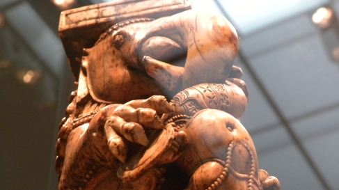
The Throne leg, showed above, carved in the 13th century and gifted from Charles Lang Freer makes use of pattern. Though not repetitive, the structure incorporates many patterns that all contribute to the main quality necessary in the use of patterns: flow. Vertical patterns run rampant down both the elephant-along his garb and on the designs embedded into what appears to be his flesh- and along the structure with which he stands on. These elements of pattern in combination convey a sense of regality and a presence which is made complete by the simple repetitive base design with which the beast stands upon.
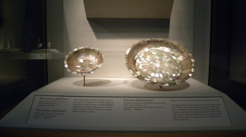
These decorative shell bowls crafted in the 17th century, make use of the balance principle of design. Though a pattern may seem present, what is more striking is the approximate symmetry present. Though the tiles are not, strictly speaking, identical in size or shape, their relative balance and symmetry both on either side and from the middle out, provide a visually pleasing piece of art. The object feels balanced to the eye, despite perhaps not being, and gives the impression of a well-crafted, wholesome, and stable -stable being the most effective- work.
A Note To Self
September 5, 2012 § Leave a comment
This is me testing out how to post on the new blog. Hope this all goes well.


